I wonder if you are having the same reaction that I am having? Each time I see an article or video about the year-in-review I slam closed my computer. I change the channel. I flee the room. I don’t want to review, revisit, reconsider, ruminate upon or attempt to make sense of what happened in this nation – to this nation – in the past 365 days.
People review the events of the year-gone-by so they might turn their eyes to the blank-page-hope for the future, just as it is common for people to slowly wander the rooms, touching walls and doorknobs – saying goodbye to their house before it is put onto market.
Mostly, the walk-through-the-past is meant to help us connect to who we are, reinforce what we value, to reaffirm what most matters before stepping into the unknown future and the forces of change. We touch the walls, not only to say goodbye, but to carry their spirit forward with us.
I’ve no need to touch the walls and doorknobs of the past 365 days. Through contrast, the events of the past year have already served to affirm what I believe and sharply clarify what I value. They have opened my eyes to both the deepest ugly and the brightest light in this democratic experiment, in human nature – and in my nature.
Lately, Kerri and I have been cleaning out the house. We’ve been discarding what is no longer useful. We’ve been re-imagining our space. We’ve been doing the same work in our relationship and with the people who populate our world. We are rounding the corner into the new year perhaps clearer than we’ve ever been. We know what side of the divide we stand on. As the nation soils itself and the communal nest, we are cleansing and simplifying our home, affirming our ideals and our sanctuary.
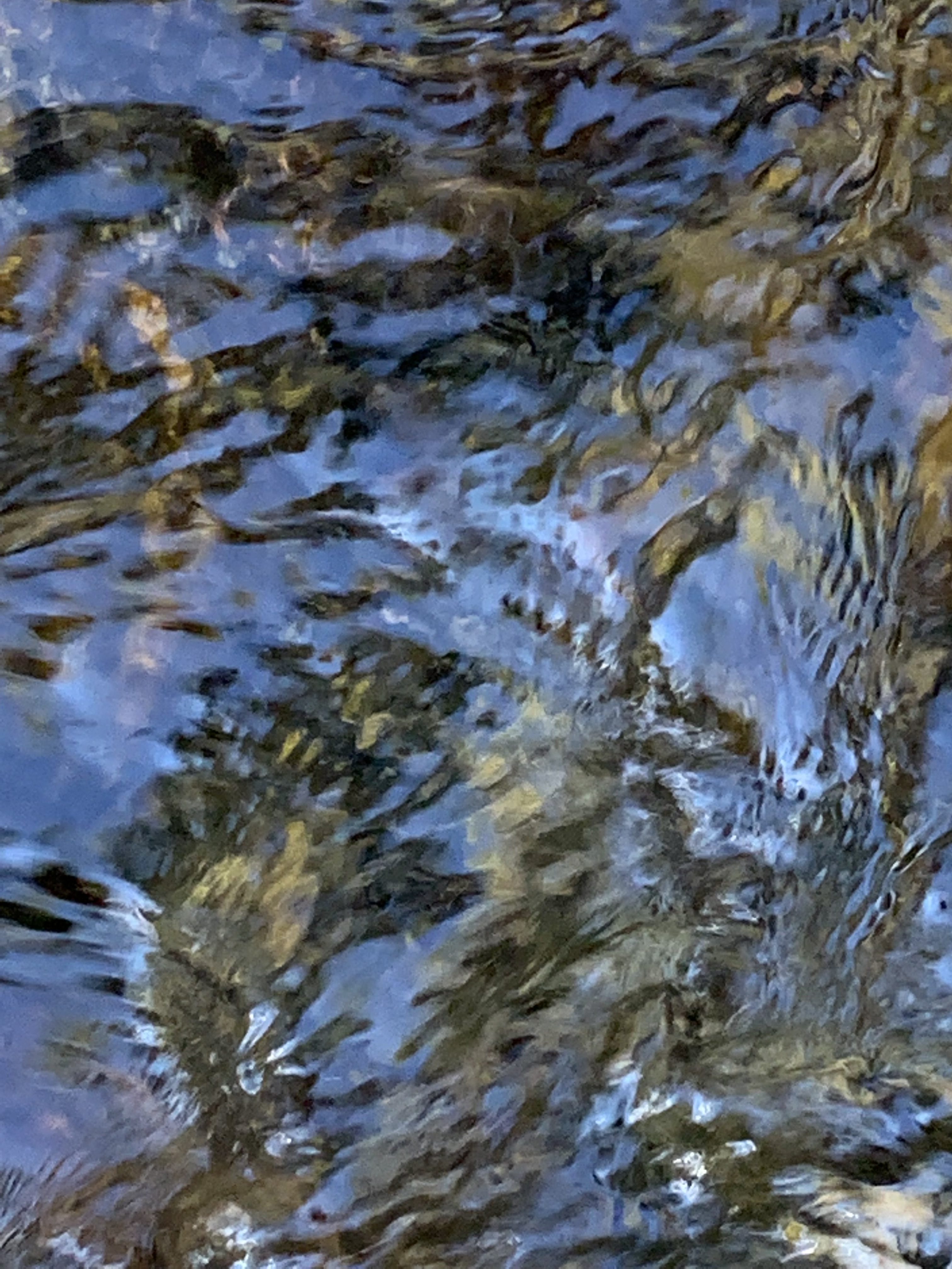
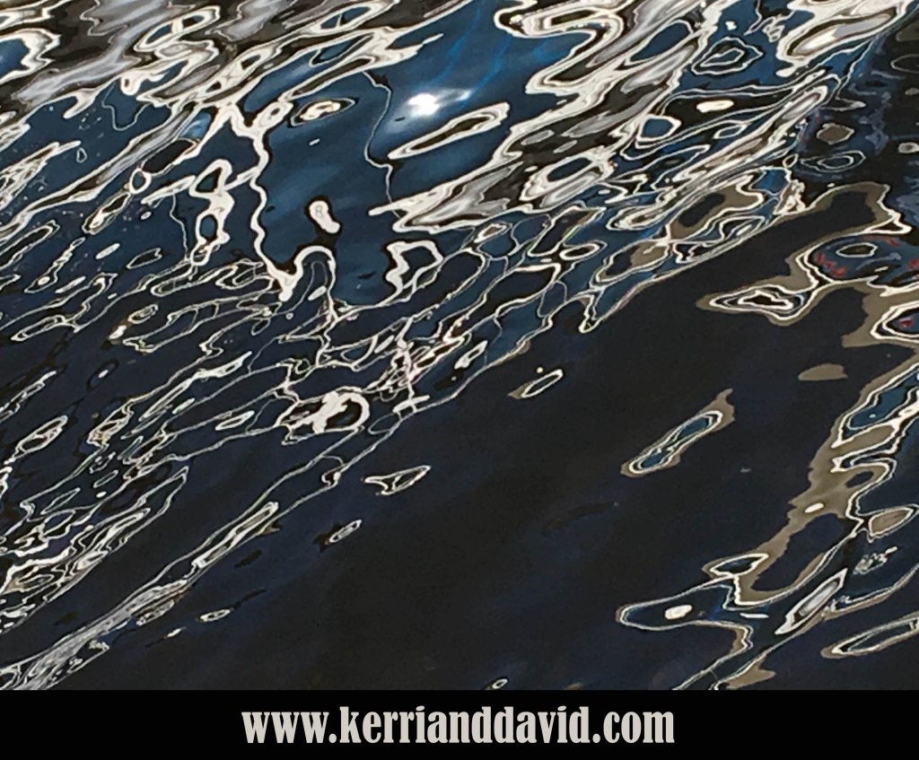
It’s been true our entire lives together: a new snow beckons us to strap on our boots and make a play-path in search of a bit of adventure and an opportunity to be surprised by beauty. It is this spirit that we carry forward into 2026. The blank-page-hope beckons like freshly fallen snow. Strapping on our boots we actively and intentionally step into the expansive white canvas eager to cultivate our capacity for surprise.
read Kerri’s blogpost about SNOW PATH

likesharesupportthankyou

Filed under: Identity, Navel Gazing, Two Artists Tuesday | Tagged: 2026, artistry, clarity, contrast, david robinson, davidrobinsoncreative.com, democracy, human nature, Kerri Sherwood, kerri sherwood itunes, kerrianddavid.com, kerrisherwood.com, New Year, play, reflection, review, sanctuary, story, studio melange, surprise, the melange, values | 1 Comment »