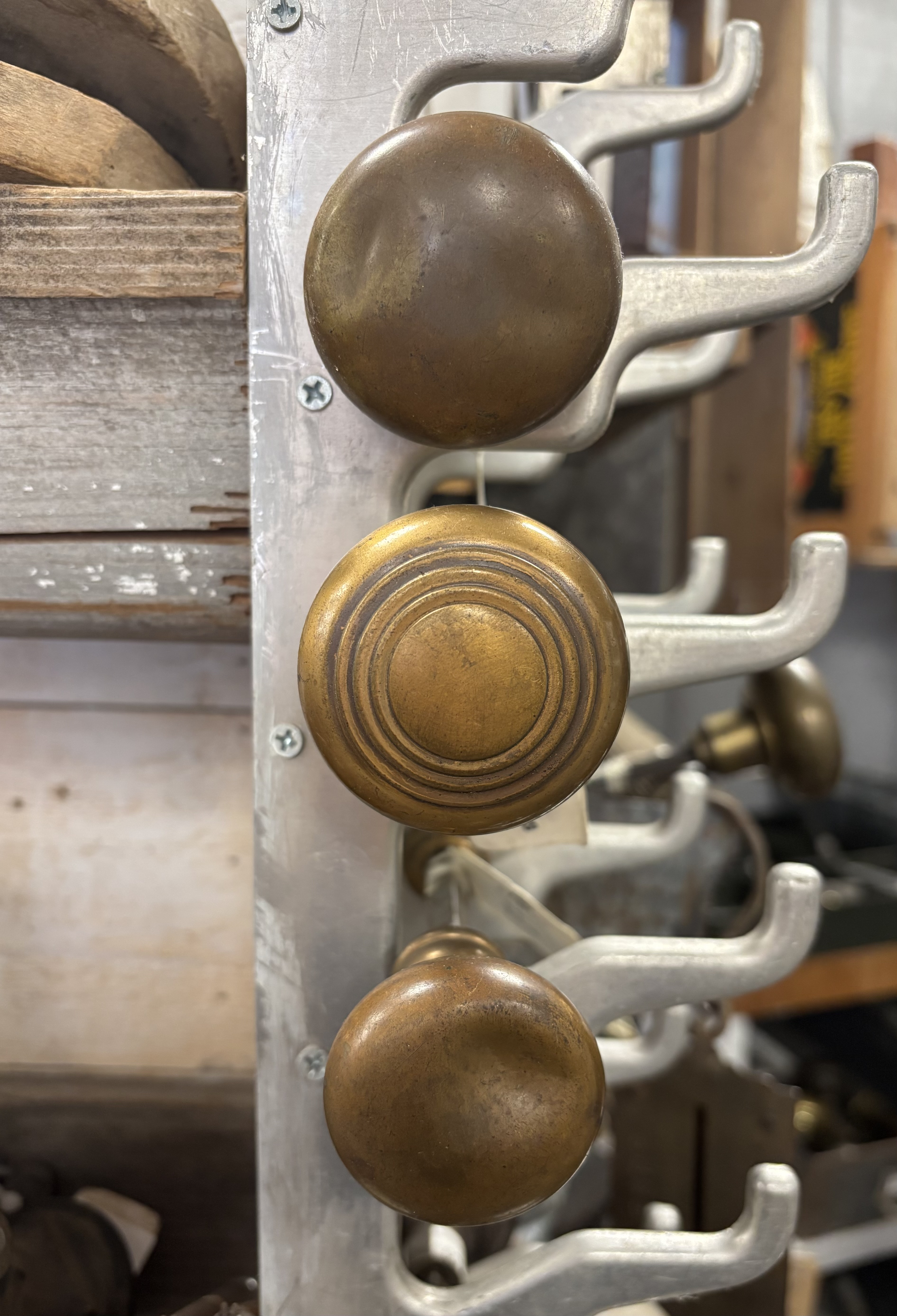
In our house it is possible to accidentally lock yourself into the bedroom. It is simple, really; there is an old doorknob on the outside of the door but the matching inner knob is missing. Close the door too hard and the door will latch just as the old knob falls. Instant bedroom prisoner. We used to keep a screwdriver in the bedroom for face-saving escapes but I looked for it after the last lock-in and couldn’t find it.
It is useful to keep in mind that our house is nearing its 100th birthday and is alive with the quirks and issues of age. I admit that we could fix the bedroom door problem but we see it less as a problem and more of a character trait. Besides, it gives the person on the outside the satisfying opportunity to play the role of rescuer. Note: the rescue always comes with the mixed message of a smirk and an admission. We’ve both been on the inside in surprise lock up.
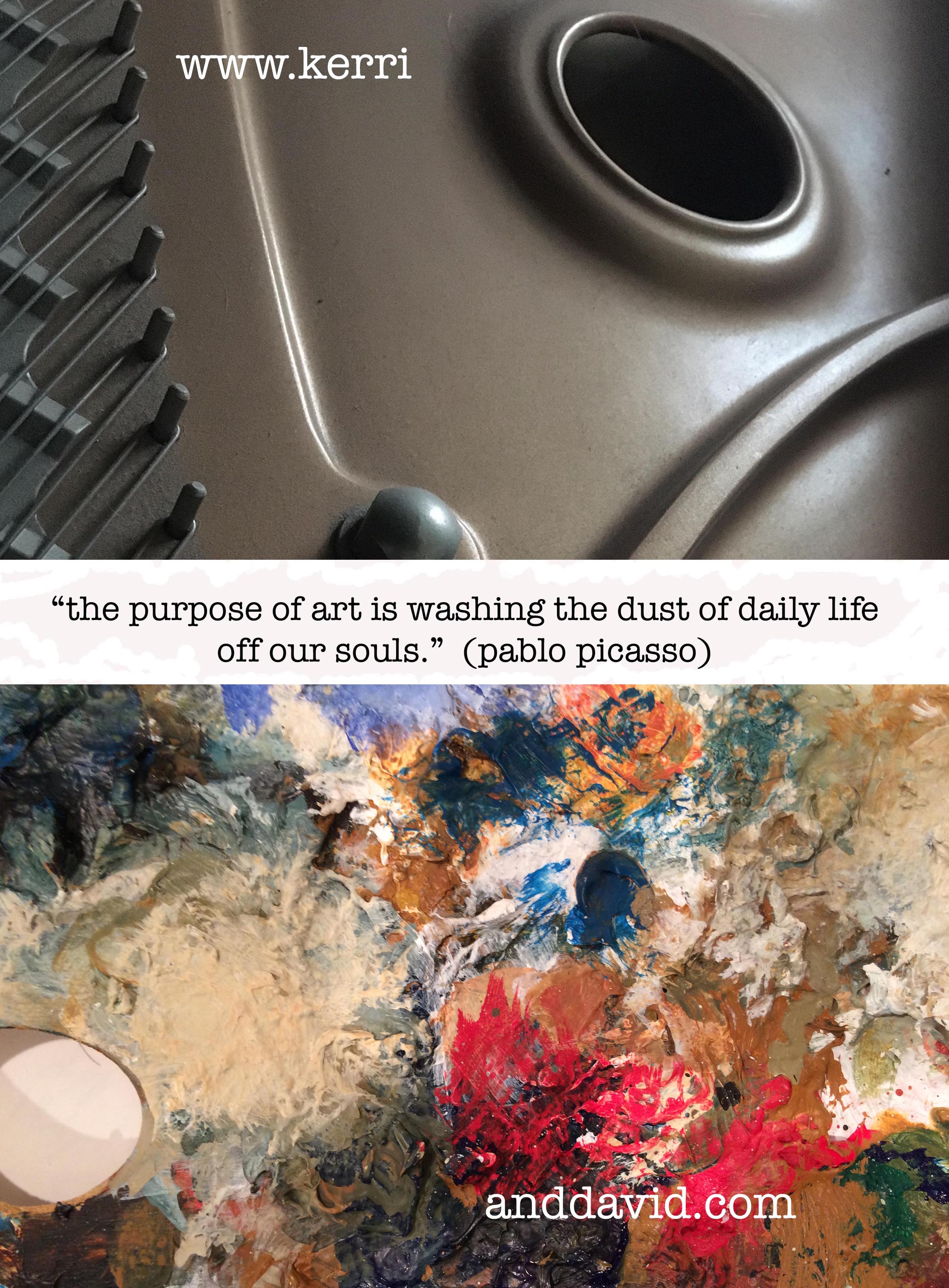
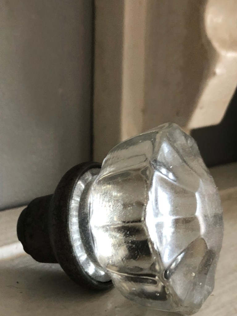
We keep a knob on the kitchen shelf. It is placed near the antique coffee pots that serve as tea containers. The knob is beautiful so it serves as a decoration. Another glass knob sits in the hole next to the kitchen faucet that once was a soap dispenser. The dispenser was problematic so it was retired but that left a hole. One morning I found a knob plugging the hole and knew Kerri was trying it on as a solution. It catches the morning light and occasionally casts a rainbow on the backsplash. Kitchen performance art; it’s a keeper.
You might be asking why we use the extra knobs as decoration or as sink-hole-fillers instead of fixing the bedroom door – and it is a fair question. Neither knob works as a knob; the inner threading is stripped. They have no internal grip so have transcended mere function and live beautifully in form. You know the old saying: form follows function. Isn’t it glorious when the function of a form evolves finally to become beauty in the world? Or, maybe it is better to ask, isn’t it glorious when we evolve and see beyond mere function and at last are capable of seeing the beauty available in our lives?
read Kerri’s blogpost about KNOBS
likesharecommentsupportthankyou

Filed under: Metaphor, Seeing, Two Artists Tuesday | Tagged: artistry, beauty, david robinson, davidrobinsoncreative.com, form, function, Kerri Sherwood, kerri sherwood itunes, kerrianddavid.com, kerrisherwood.com, old house, quirks, story, studio melange, the melange | 1 Comment »