Clepe Incredible [David’s blog on KS Friday]

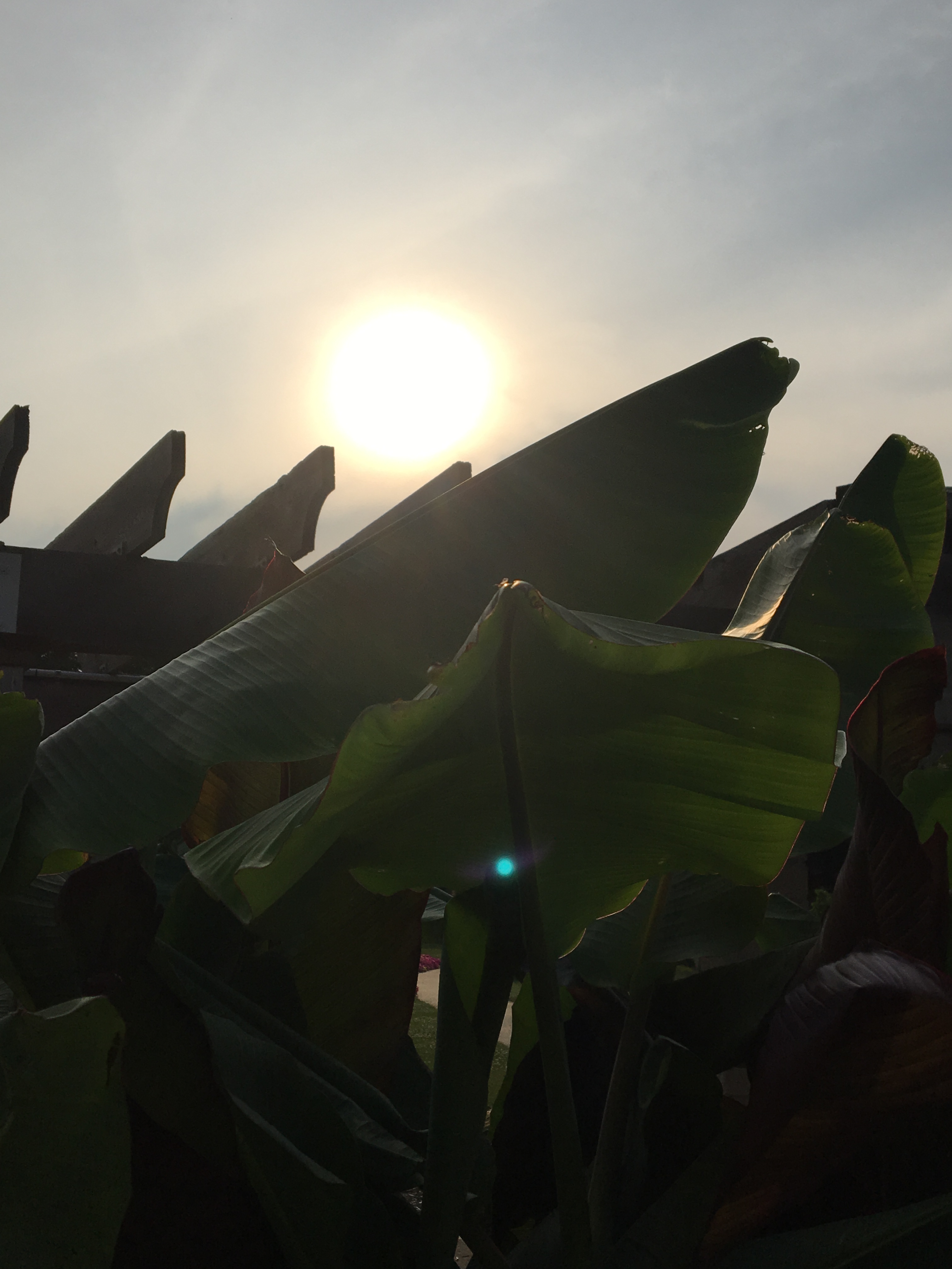
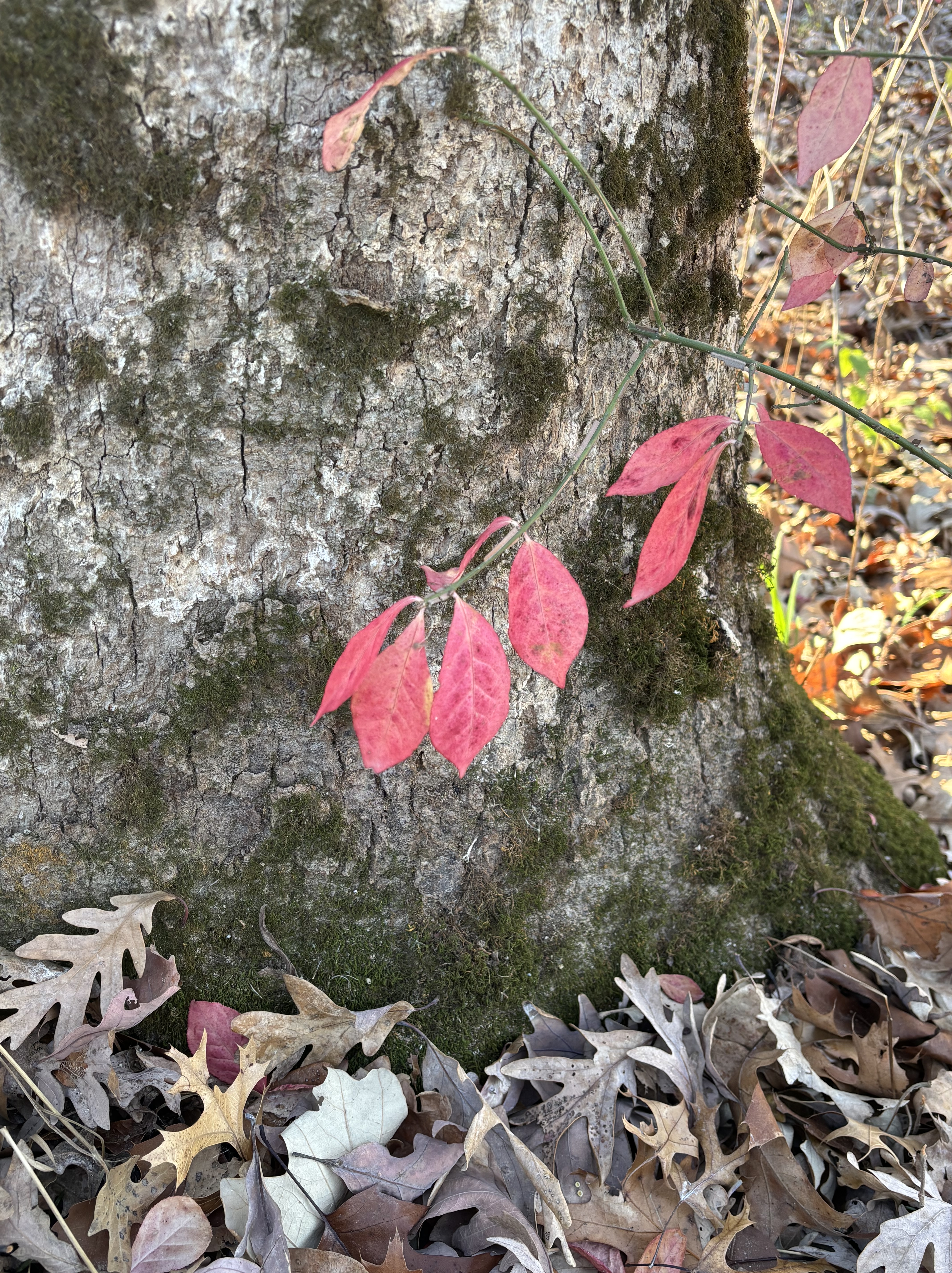
This is the time of year that color in nature becomes shocking. It is the consequence of nature’s contrast principle: the greys and browns of oncoming winter meet the vibrant yellow, orange and red of the leaves-last-stand. Last week, while walking Dogga, I stood for several minutes beneath a tree made electric by the morning light. I felt as if I had entered another reality.

Contrast principle is really about how comparison shapes perception. I only know that I’m having a bad day because I believe that I’ve had good days. Last night I watched Anderson Cooper interview Tig Nataro for his series exploring grief. Tig Nataro recently lost her friend, poet Andrea Gibson. The love of life comes clear in the moment of the loss of life. The appreciation of life sharpens when the end rolls into view. Contrast principle.

I bumbled into an archaic word that is new to me: clepe. It means to give someone or something a specified name. To name. I was cleped David. As my end rolls into view I am more and more resisting the impulse to clepe my days. Why should my days be labeled either good or bad? On my last day, what will I be willing to give to have one more moment of this life? Why not clepe incredible each and every moment that I am fortunate enough to experience?

LAST I SAW YOU on the album THIS PART OF THE JOURNEY © 1997 Kerri Sherwood

Kerri’s heart is available for sharing on iTunes and streaming on Pandora

read Kerri’s blogpost about THE VIBRANT LEAVES

sharelikesupportthankyou

Responsible Opposition [David’s blog on KS Friday]

Among the many things our city does well is the design and maintenance of the gardens in the parks. Colorful and well-tended, carefully planned beds of flowers. My favorite plots juxtapose vibrant, tender petals that surround sturdy broad red banana trees. The beauty found in opposition. Contrast.

Horatio said that he was worried for the democrats. “They have no responsible opposition,” he said. The operative word in his sentiment is “responsible.” As we all know, there is no lack of opposition yet the former GOP has lapsed into a low-bar, name-calling, opposition-for-opposition-sake; it stunts the growth for all involved. It’s the Achilles Heel of the red-hat-cult. When opposition is the end-goal there is no need for ideas or solutions, no service to a greater good, no vision for the future. There is no ethic. There is no lie-too-far to resurrect some made-up-past-glory-fantasy. Opposition-for-opposition sake has only one aim: to attain and keep power.

And then what?

Maintaining power-for-the-sake-of-power is a well-known path worn into history by the likes of Stalin and Hitler. Pol Pot. Mussolini. Putin. Kim Jung Un. The path ultimately – and always – leads to the killing fields. Absolute power is never a worthy or sustainable reason-for-governing and always, in the end, eats its own people. Opposition-for-the-sake-of-opposition, once in power, eliminates by any means all other points-of-view. It silences any voice of responsible opposition. Read Project 2025 for a step-by-step blueprint on how to reduce a two-party democratic republic into a single party authoritarian state.

A healthy two-party system – democracy – is designed to bring opposing ideas to the table for debate and discussion. The point is not opposition. The point is agreement. Compromise in service to the greater good. Checks and balances. The point, at its best, is like the gardens I so appreciate, vibrant juxtaposition, carefully planned and respectfully maintained.

Democracy is made beautiful through responsible opposition. It’s a two-party system. Democracy disappears without it.

Our garden needs tending, a task for which we are all responsible. Our garden already has a great plan. It’s called The Constitution. Opposition-for-the-sake-of-opposition is like an invasive weed. This red-hat-weed will not just go away. It’s our job – all of us – to act, to call it out, to vote, to make certain the weed is pulled for good (pulled for the public good) and that the two party system, with an ethical GOP, dedicated to the rigorous and worthy task of finding agreement through responsible opposition, is restored to the service of our greater garden.

Figure It Out on the album Right Now © 2010 Kerri Sherwood

Kerri’s albums are available on iTunes and streaming on Pandora and iHeart Radio

read Kerri’s blog about RED BANANA TREES

Share. Like. Support. Subscribe. Comment. Thank you!

Pass Through [David’s blog on Two Artists Tuesday]

“Love does not begin and end the way we seem to think it does.” ~ James Baldwin

We watched each day as the pink tulips passed through their many phases of life, each beautiful and surprising. As they neared the last chapter, I thought they echoed orchids. The subtle pinks ran to the edges of the wrinkling petals, heads bowed, devotees in quiet prayer.

Initially, the tulips brought hope and light into our house. For weeks the table had been stacked with so-much-paper, a mammoth project. We cleared the table of its heavy burden and replaced the weighty paper with a row of delicate tulips. We’d catch ourselves staring into the dining room; inevitably one of us would say, “I love this.”

20 would call it the contrast principle. The delicate lightness of the tulips were made more pronounced because of the heaps of paper that preceded it. Perhaps. All I know is that the tulips lifted my spirit like few other things have in these winter months. They became a celebration of love. A symbol that joins daisies in our canon of symbols and will forever signify a step into love. A new chapter. A next chapter.

As it bowed its petals, as they began to fall, we found ourselves more rapt in their beauty, not less. Their age made them translucent. Fragile. Their impermanence somehow made them eternal. As it should be. Passing through transformation.

“I love this, she said, squeezing my hand.

read Kerri’s blogpost about TULIPS

like. subscribe. comment. share. support. many thanks!

Grok The Rule [David’s blog on Two Artists Tuesday]

“A good poem looks life straight in the face, unflinching, sincere, equal to revelation through loss or gain.” ~ David Whyte

A good rule of thumb in the visual arts: areas of high contrast, in color-or-value, come forward while areas of low contrast retreat. Landscape painters use this rule to create the illusion of foreground and distance. Abstract painters use this rule to move the eye around a composition.

Storytellers and poets use the same rule. High contrast creates interest. It grabs attention. Low contrast sets the environment, the mood. “Some kind of relaxed and beautiful thing/ kept flickering in with the tide/ and looking around./ Black as a fisherman’s boot, with a white belly…” Dogfish by Mary Oliver.

Misused, it’s the rule-behind-the-reason that most of our news is “Breaking News!” False contrast. Hype. It’s the reason our national portrait is continually painted as divisive. High contrast pulls focus. The money follows the ratings so attention-grabbing is highly prized. Low contrast – like agreement, collaboration, sameness, community…truth – doesn’t generate the same level of interest or income.

Like all rules, there are worthy reasons to wield them. In the arts, the contrast principle is used to illuminate unity. To break an individual through to the experience of something bigger. To open questions. In our news-of-the-day, the rule is used to whistle a song-and-dance of discord and distraction. To separate into tribes. To manufacture the illusion of depth while sitting in shallow water.

The reasons to wield the rule are diametrically opposed.

It was a sad day when the young man, standing in our living room, told me that he would educate his child at home. His reason? He didn’t want his son to be stuffed with ideas. “Just the facts,” he said. “Just the facts.”

“Poor souls,” I thought of this man and his young child. How will they ever stare into the fiery face of democracy – an ongoing idea born of high contrast and wild ideas – the artistic kind, meant to bring people together in one nation under every possible god – like a poem. They won’t recognize democracy’s death when without question it slips like ashes through the fact of their fingers.

As for me, I’ll stick with the high and low contrast of Rumi, MLK, Shakespeare, Kahlil Gibran, Mary Oliver, Maya Angelou…

“Your task is not to seek for love, but merely to seek and find all the barriers within yourself that you have built against it.” ~ Rumi

[another worthy rule of thumb: never read the headlines prior to writing a post. All the icky-mush rushes to the foreground and permeates my brain]

read Kerri’s blogpost about FOG

like. share. support. comment. let us know you are out there.


buymeacoffee is a counterintuitive, highly appreciated, offering of support amidst a high contrast environment that keeps the artists among us hopping and hoping.

Embrace The Contrast [David’s blog on DR Thursday]

In art it’s called the contrast principle. The pairing of elements that are opposite from one another. Or somehow different. Man made next to nature made. Fabric next to steel. Autumn color next to grey and white.

Contrast principle is a fundamental, not only in art but in perception. We only know ourselves through relationship with others. I am a son, a husband, a friend. These designations are also examples of the contrast principle. I know myself, I perform myself, based on the others that I am with.

Contrast need not be oppositional. It can be a complement. Red and green. Blue and orange. Relationships that change the individual colors. Together they are bold. Lively in their contrast.

A single color on a canvas, a single idea in a brainstorm, a single party in a congress, is static. Bland. Lifeless. Ellsworth Kelly placed his wall-size blue canvas next to a wall size yellow next to a wall size red. Primaries in contrast capable of snapping your head back when first you see them. Dynamic. Alive.

A community with contrast, a community of color and varied ideas, a community that embraces the value and power of the contrast principle, is capable of anything. The illumination of each other. The best kind of harmony.

read Kerri’s blogpost about LEAF AND PILLOW

like. share. support. comment. contrast. compare. any and all are much appreciated.

buymeacoffee is a study in contrasts that affords you the opportunity to support the work of the artists you may or may not appreciate.

Listen To Claude [on Two Artists Tuesday]

In his 60’s, the famous Impressionist painter Claude Monet went blind. Cataracts were removed, restored his sight, but also changed his capacity to see color. He painted in blues because he couldn’t perceive red and yellow. He was not fond of the paintings that he produced. He painted what he could see. Historians, on the other hand, credit his blue paintings as an important link to abstract painting.

We never really know the impact of our actions or our work.

The path paralleled a stream. As we walked up the mountain, she stopped often and took photographs. The sun on the water was enticing so she aimed her camera at the stream. “Look!” she said, showing me. “These look like abstract paintings!”

“They look like Monet,” I said. “Gorgeous.”

Whether they know it or not, artists are always having conversations with their artistic ancestors. I was amused at the idea that Kerri and Claude were having a chat. The world of a master painter, living before ubiquitous photography, meets they eyes of one who sees and quickly captures.

I was also amused that, through Kerri’s picture, Claude and I were having an exchange. “I love your blues,” I say. Claude responds, “Ah, but it’s the reds and yellows that make the blue so vibrant. Contrast principle,” he winks.

Excited, she returned to the stream to take more photos.

I turned my face to the sun. I breathed in the mountain air, the aspen leaves fluttering. I have not finished a painting since the pandemic began. “I feel empty,” I say to Claude.

“We paint what we see, ” Claude whispered. “Sometimes we simply cannot see.”

“Yes,” I said, “I am blind. But my cataracts are not in my eyes.”

“No,” Claude replied. “You are not blind, you see well enough. You’ve closed your eyes.”

“Lookit!” Kerri smiled, “These are so cool!” She shows me more water close-ups, a symphony in orange, blue and gold.

“Don’t worry,” Claude smiled. “When you are ready, you’ll open your eyes again. You’ll see a whole new world. New colors and shapes. More than blue.”

“You think so?” I ask.

“Isn’t it beautiful!” Kerri glowed.

“Do you see?” he smiled and faded into the photograph.

“Yes,” I laughed and nodded, “It’s really beautiful.”

read Kerri’s blog post about MONET WATER

images of water © 2021 kerri sherwood

Contrast [on Two Artists Tuesday]

contrast principle copy

It is the ultimate cliche’: we only know light because of dark. 20 calls this the contrast principle. Images juxtaposed illuminate. It’s how stories are told in film. Once. Upon. A. Time. It is how images pop off the canvas, blue next to orange, green meets purple. Contrast makes the eye move. Contrast makes shapes emerge. Movement has no meaning without stillness.

It’s relative. Related. Relationship. Without relativity, without contrast, nothing makes sense. Or, more to the point, nothing is sensed. Difference, in fact, is the secret sauce necessary for knowing anything. Category. Class. Classification. Group. What is like what? What is related? What is unrelated? Cubicle. Caste. Lines on a map.

Contrast can be wielded like a sword. They are not us. Division.

Or, contrast can be used to unify. A crossroads of diverse perspectives, innovation.

Nature is dynamic at its edges. Water meets beach. Earth meets water. Air breathes fire. Hot meets cold. Convection current. Contrast. Changing energies. Creative movement.

Kerri stopped during our walk. “Look!” she exclaimed. Her eye was drawn to the lone daisy in the midst of the sea of black-eyed susans. “Beautiful,” she whispered as she approached with her camera. “Look at the contrast.”

So similar. So different. Yellow meets white. Black meets yellow.


read Kerri’s blog post about CONTRAST


tpacwebsitebox copy


daisy in the black-eyed susans ©️ 2019 kerri sherwood