But If I Had [David’s blog on Not So Flawed Wednesday]

I’ve never taught visual art but if I had, I’d have sent my students outside to look at color in nature. I wouldn’t spend a moment having them study an abstract color wheel or match paint swatches indoors. Together we’d look at light, the angle of the sun. We’d play with shadows and discover the changing hue of shadows; they are more full of color than we want to admit.

We’d bring-to-light, uncover, unearth…we’d learn to see, a skill much more valuable to the artist than merely looking. We’d walk through the world as if for the first time. We’d share our color notes. We’d tease and be teased by a full range of morphing value as the sun played with our perception.

We’d remind ourselves that our window on this life is only open for a short while. We’d saturate ourselves in the infinity of shapes and textures, the marvel of pattern and interconnection; the riches of diversity. We’d immerse-in-the-immensity and not pretend that we were in any way separate or better-than.

We’d stave off a world insistent that we live within the narrow strictures of black and white, bland cubicles of dulled minds. I’d have sent my students outside to wander into their thicket of questions and step boldly into a world without answers but alive in rich, vibrant color.

read Kerri’s blogpost about THE LEAF

likesharesupportthankyou

Grok The Rule [David’s blog on Two Artists Tuesday]

“A good poem looks life straight in the face, unflinching, sincere, equal to revelation through loss or gain.” ~ David Whyte

A good rule of thumb in the visual arts: areas of high contrast, in color-or-value, come forward while areas of low contrast retreat. Landscape painters use this rule to create the illusion of foreground and distance. Abstract painters use this rule to move the eye around a composition.

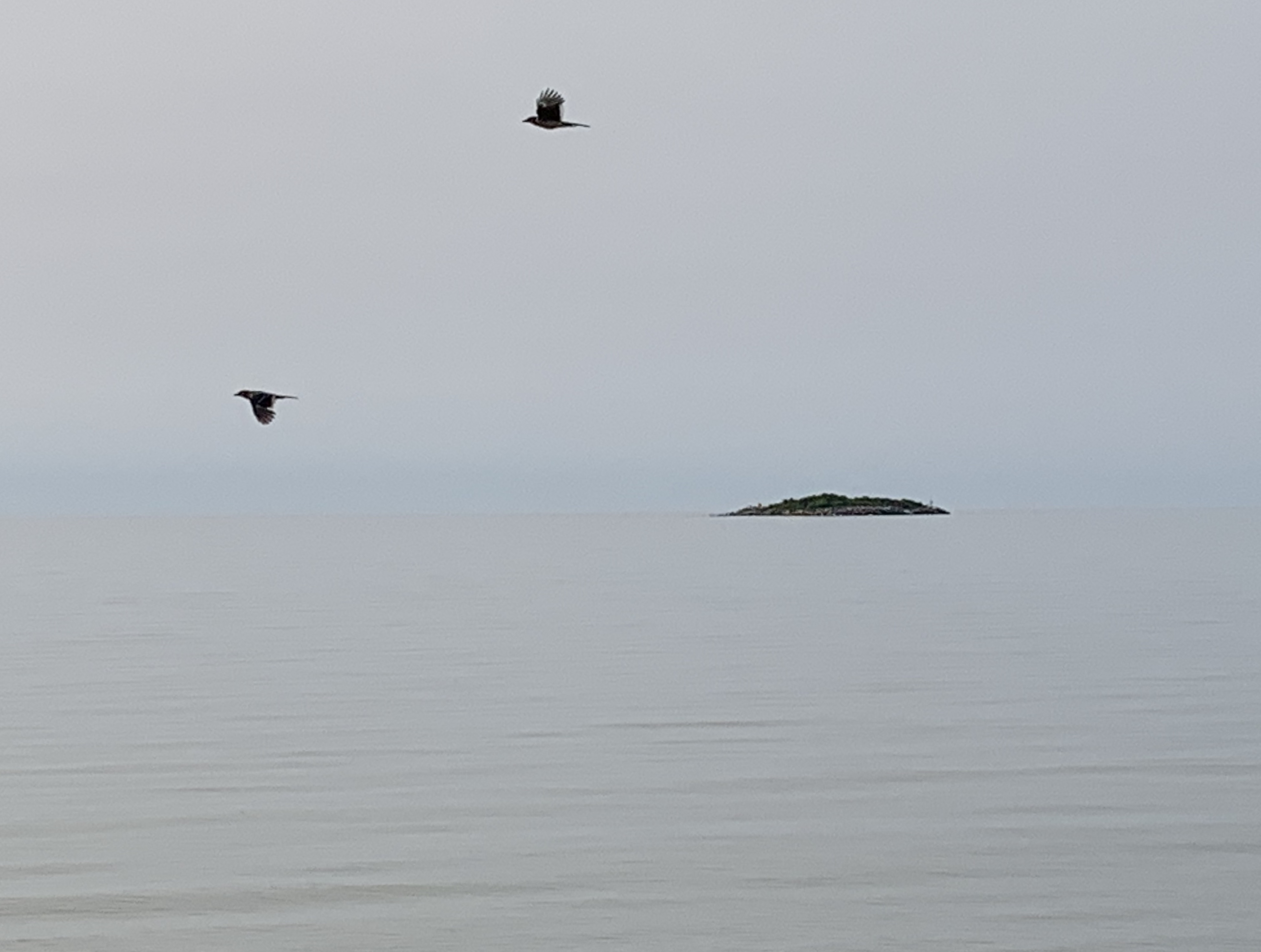
Storytellers and poets use the same rule. High contrast creates interest. It grabs attention. Low contrast sets the environment, the mood. “Some kind of relaxed and beautiful thing/ kept flickering in with the tide/ and looking around./ Black as a fisherman’s boot, with a white belly…” Dogfish by Mary Oliver.

Misused, it’s the rule-behind-the-reason that most of our news is “Breaking News!” False contrast. Hype. It’s the reason our national portrait is continually painted as divisive. High contrast pulls focus. The money follows the ratings so attention-grabbing is highly prized. Low contrast – like agreement, collaboration, sameness, community…truth – doesn’t generate the same level of interest or income.

Like all rules, there are worthy reasons to wield them. In the arts, the contrast principle is used to illuminate unity. To break an individual through to the experience of something bigger. To open questions. In our news-of-the-day, the rule is used to whistle a song-and-dance of discord and distraction. To separate into tribes. To manufacture the illusion of depth while sitting in shallow water.

The reasons to wield the rule are diametrically opposed.

It was a sad day when the young man, standing in our living room, told me that he would educate his child at home. His reason? He didn’t want his son to be stuffed with ideas. “Just the facts,” he said. “Just the facts.”

“Poor souls,” I thought of this man and his young child. How will they ever stare into the fiery face of democracy – an ongoing idea born of high contrast and wild ideas – the artistic kind, meant to bring people together in one nation under every possible god – like a poem. They won’t recognize democracy’s death when without question it slips like ashes through the fact of their fingers.

As for me, I’ll stick with the high and low contrast of Rumi, MLK, Shakespeare, Kahlil Gibran, Mary Oliver, Maya Angelou…

“Your task is not to seek for love, but merely to seek and find all the barriers within yourself that you have built against it.” ~ Rumi

[another worthy rule of thumb: never read the headlines prior to writing a post. All the icky-mush rushes to the foreground and permeates my brain]

read Kerri’s blogpost about FOG

like. share. support. comment. let us know you are out there.


buymeacoffee is a counterintuitive, highly appreciated, offering of support amidst a high contrast environment that keeps the artists among us hopping and hoping.

Watch Them Play [David’s blog on Not So Flawed Wednesday]

I’m not sure if the colors are especially exceptional this year or if I am simply more conscious of them. Either way, every time I step out the door I am gobsmacked by the vibrant hues and color-tones.

An earlier version of me would have been compelled to recreate the color-pop on a canvas. Now I am content to stand still in appreciation. To drink it in. The colors change each day. They change with the light. Grey skies make the color sing. When the sun is low in the sky, the plumes on the grasses are electric.

For fun I downloaded “color tips” from Art2Life. He’s terrific. One of his tips is to make one color the hero of the composition. So, I’ve found myself – in mid-gobsmack – asking “Which color in this autumn symphony is the current hero?” And, to my great delight, there is always a standout, a color hero that commands my eye. And, to my even greater delight, when I return later to the exact location, there is an entirely different hero; the previous hero has no problem moving into a supporting role.

Light flickers. The sun arcs across the sky. The heroes share the stage without an ounce of competition. Theirs is an infinite game. I am so grateful that I am here to watch the colors play.

read Kerri’s blogpost about THE GRASSES

like. support. share. comment. color. witness. share the stage. all are appreciated

buymeacoffee is a fancy-pants-online “tip jar” where you can support the many colors you experience because of the continued work of the artists that help you see.

Read Marc’s Notes [on DR Thursday]

marc chagall quote copy

One of my most prized possessions is a handmade notebook, stitched together by a young DeMarcus Brown, mentor of my mentor, in a time before corner drugstores and readily available school supplies. It is filled with the fading pencil notes Marc made when he was a student learning about color, probably in 1918 or 1919. It occurred to me as I wrote that guesstimate of time that he was scribbling notes about color during a pandemic.

It reads like an enthusiastic discovery of miracles. On page one the word COLOR is triple underlined. “Light is a form of radiant energy transmitted by wave movement through SPACE and is perceived VISUALLY. Opposite is DARKNESS. Qualities of Light: 1) Physically – Life giving. 2) Mentally – Intelligence. 3) Spiritually – Divine Wisdom.”

From Marc, on page one, on day one of his study of artistry, I learned that color is life giving, intelligent, and a source of divine wisdom.

“Objects reveal light.  All forms and substances REFLECT or ABSORB LIGHT. THINK OF COLOR AS LIGHT REFLECTED.”

There are other words and phrases: vibration, proportion, visual sensation, light is individualized by its contact with substances into color. COLOR is Light PROPORTION.

All of this awe is written in block letters on the first two pages. His enthusiasm is palpable. As you move through Marc’s notebook of discoveries, his writing shifts to cursive, he matures in color and intention. His passion intensifies. He is beginning to see.

Toward the end of his notebook, in his growing sophistication, you’ll read these phrases:  “Train our eyes to DEGREES of Neutrality. Establish relationships of Intensity. Hue. Value”…and a reminder “vibrating surface!”

The stitching that holds the notebook together is impeccable. Beautiful. Careful. Considered. It took him time to make his notebook. It mattered.

I can’t help my metaphor mind from finding a universe of guidance in Marc’s notebook for a nation that perpetually struggles with color – or, ironically, the negation of color. The fear of color relations. A commitment to a narrative of dominance, this or that but never both. A palette of loss. We’ve limited our color study to a polarity and eliminated the infinite shades of possibility in the picture we might paint. Insistent chiaroscuro.

What happens when the door of possibility opens? When change, that big blank canvas, sits on the easel?

In the middle of his 90’s, Marc gave me his paint brushes, his paint box. “Use them!” he said, “Don’t save them for remembrance.” He knew I was sentimental. “Reverence is off limits. These are not meant to collect dust on a shelf.” He laughed, “Use the damn things. Don’t be safe!”

Color. Vibration. Relationship. Proportion. Life Giving. Intelligent. Divinely Wise. Walk into the unknown. Learn to see.


read Kerri’s blog post about COLOR


their palettes website box copy


Stand In The Enormity [on Not So Flawed Wednesday]

two birds and an island copy

When Kerri first showed me this photograph, it read to me like a minimalist painting. A subtle field of color with two splashes and a brushstroke. So much said with so little. A meditation of movement and the immovable.

The lake is different every day. Its color palette is as changeable as its moods. Each day upon awaking, Kerri walks onto the deck and snaps a picture. So far, no two days are alike. So far, no two hours are alike.

Once I stood in La Sagrada Familia and the enormity of it made me quiet. The lake is like that. Immense to the point of stillness.


read Kerri’s blog post about TWO BIRDS AND AN ISLAND


feet on the deck steps website box copy