A Different Understanding [David’s blog on Not So Flawed Wednesday]

Sometimes color stops me in my tracks. The color of a sunset. The color of a canyon. The color of a flower. This hot coral coneflower stopped all engines.

David Hockney is a colorist. Henri Matisse. Judy Chicago. Piet Mondrian. Sonia Delaunay. There are so many painters whose use of bold color, like the coneflower, stops me in my tracks. Ellsworth Kelly. Mark Rothko.

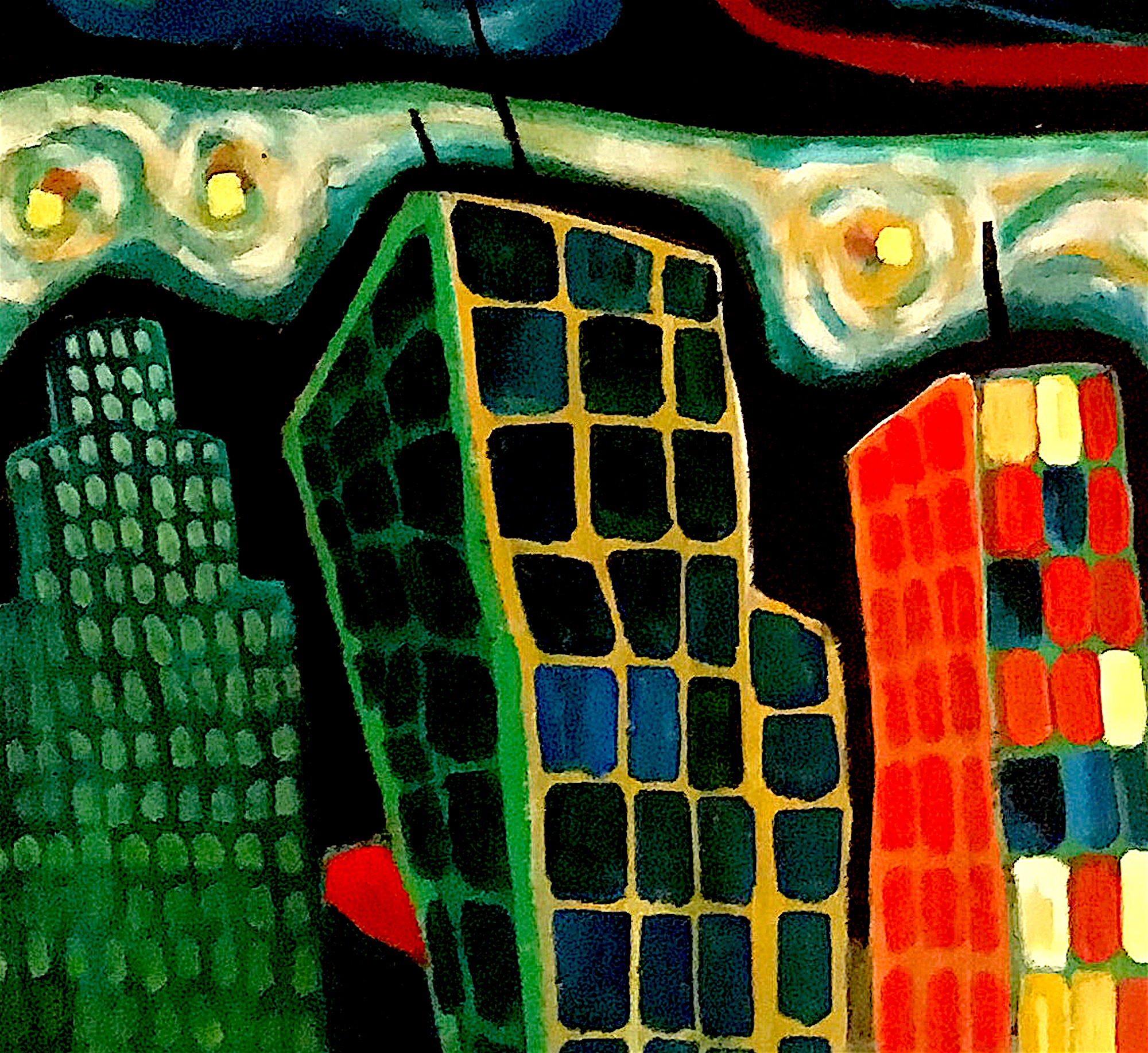
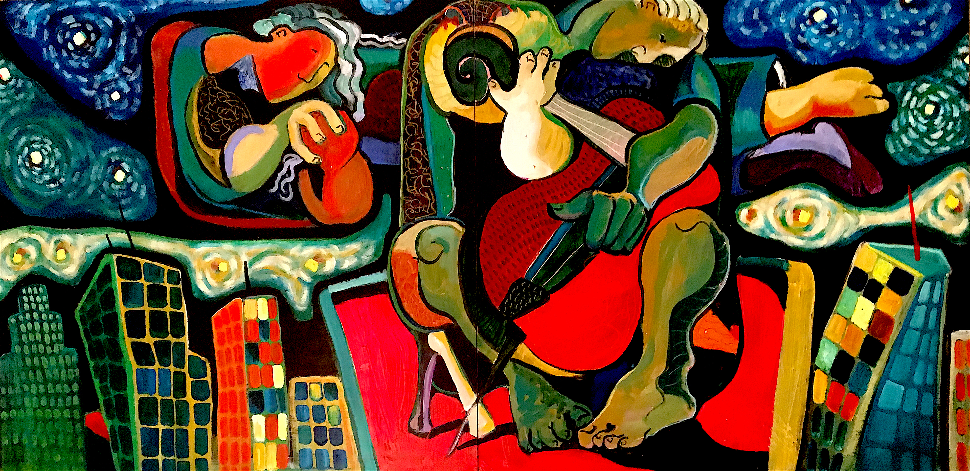
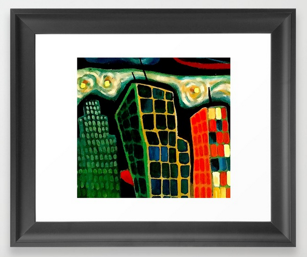
With my love of color you’d think I’d be a colorist painter. Although I’ve had my moments, mostly I sort to earth tones. The neutrals. Once, a viewer of my painting, Unfettered, asked “Were you going for stone?” I wrinkled my nose and let the question hang unanswered.

Many years ago I mimicked David Hockney’s colors. I pushed myself to live in vibrancy. I loved the exploration but was rarely comfortable living in so much visual enthusiasm. I am too much the introvert to comfortably scream from my canvases.

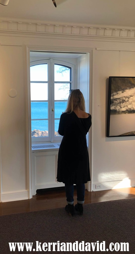
I just washed over my latest painting, County Rainy Day. Kerri was appalled but I’d veered off course and hit color saturation too soon. I needed to reset. I generally work things out in process – instead of doing studies – so wiping off or washing over a canvas is not unusual. Like Kerri, John K used to chastise me, too, saying “Do versions or variations!” Versions and variations are expensive and I’ve rarely had abundant resources in my life. Every action has a history.

Recently Andrew Wyeth has once again caught my fancy. I’d never suggest that he is not a master of color – he is – but his paintings tend toward the neutrals. He captures something deeper, his visual language is as much that of a poet as a painter. A different understanding of color.

I imagine that, like me, on his daily walk, the color of a coneflower or the shape of a leaf stopped him in his tracks. And, one way or another, that startling moment of appreciation found its way into his heart and onto his canvases.

reset: County Rainy Day (detail)

read Kerri’s blogpost about SALMON CONEFLOWER

like. share. subscribe. comment. support…thank you.

Listen To Leonardo [David’s blog on Two Artists Tuesday]

You need look no further than nature to understand where David Hockney gets his vivid color palette. Vibrant orange, yellows and greens. Brilliant-color-paintings borne from a luminous colorful world. All he needed to do was open his eyes.

I laughed aloud when I bumbled into this quote from Leonardo da Vinci: Blinding ignorance does mislead us. O! Wretched mortals, open your eyes! It’s somehow comforting knowing that, even at the height of the Renaissance, the apex of the great enlightenment, blinding ignorance was running rampant through the streets. I’m particularly fond of Leonardo’s cry of despair. O! It invites me to ponder what he saw that wrought his distress and subsequent appeal to “open your eyes!”

This morning in the kitchen, making breakfast and waiting for the potatoes to crisp, my mind was awhirl with nonsense. I held the wooden spoon and stared at nothing, so taken was I at the frenetic yammering in my brain. Gloom and doom. The news of the day. Then, in a moment of unintentional grace, I heard Leonardo’s cry, “O!” I followed his advice. I pulled a page from David Hockney and opened my eyes. In the calm quiet that ensued, I saw the magic-shadow-dance of the fan whirring above my head, the soft morning light reflecting off the wall made the room glow. The smell of rain on earth. Wren song.

Blinding ignorance. Monkey mind. 20 tells us that gossip is a more powerful force than gravity.

And a force more powerful than gossip, an antidote to the ignorance that blinds? Open your eyes. See the vibrant, colorful world immediately available beyond the discord. It will still the foolish noise (both inside your brain, and out).

read Kerri’s blogpost about ORANGE!

like. share. support. comment. thank you!

buymeacoffee is a donation “tip jar” where you may support the continued work of artists that you value.

Labor For Surprise [on DR Thursday]

I designed the set using a David-Hockey color palette. Rich and vibrant. A gifted scenic artist brought my renderings to life. I was concerned. Sometimes what looks good on paper does not scale well. Sometimes scaling up fulfills the promise. Dreams are that way, too. You can’t possibly know a good idea is genuinely good until you give it a try.

I moved from California to Seattle. When I first arrived in Seattle I took my paintings to many, many galleries hoping to find representation. I was excited to be in a city with a mature art scene. I was ready to scale up my career. The response was unanimous: my paintings were too vibrant. Too much color. As a kindness, one gallery owner suggested that my paintings were appropriate for a California audience but would never sell in Seattle. Apparently the cloudy skies and reputation for rain dampened en masse the local appreciation of color.

I was deflated but undeterred.

After a season or two in Seattle my color palette was noticeably different, toned down. The ubiquitous rain naturally muted my spectrum of color. There’s no telling what will happen when lofty dreams hit the hard work of reality. It’s unpredictable. The labor of surprise. Once I was sufficiently color-muted, everyday, every-single-day for 15 years, I showed paintings in galleries, in coffeehouses, in theatre lobbies, in studios, in pop-up shows…

I left Seattle when I met Kerri. I knew immediately that she was The One. Early on, before I actually moved, as we were driving around town, I wondered if my art-life would survive in this new place. I wondered if it was time for me to scale down. The same rule that applies to scaling up also applies to the opposite direction. It was new territory. My dream had never included the idea of trimming. From this vantage point I can safely say that I had no idea how hard it would be and no idea of the abundant changes – that brought simple abundance – this move would bring.

Yesterday Jen asked, if we had life to live over again, and money wasn’t an option, would we make the same choices. Kerri and I laughed heartily at the money-part. This path has been hard – so far, money hasn’t been an option – but we were unanimous and immediate in our response: I wouldn’t – we wouldn’t – change a thing. This dream was and continues to be a genuinely good idea, regardless of scale, filled to the brim with vibrant color and the hard labor of surprise.

cloud watchers, acrylic on canvas, 20×49.5IN, © circa 2002

My still-as-yet-unfinished-because-I’m debating-the-how-what-and-why-of-my-life-website

read Kerri’s blogpost about PEONY RAIN

if you like it, like it. share it. comment, or buyusacoffee. we love writing it and appreciate that you read it.

Make It Visible [on Two Artists Tuesday]

“I believe that the very process of looking can make a thing beautiful.” ~ David Hockney

Sometimes I look at a blank canvas and see a composition. My job is to follow the image. To make it visible.

Sometimes I have an idea and I bring it to the canvas. My job is to explore the idea. To make it visible.

It’s a chicken-and-the-egg conundrum. What comes first? When I look at the peony do I see beauty or do I bring beauty to what I see? Is beauty a decision?

“Good-God!” I hear Kerri’s inner monologue-commentary on my too-ponderous questions. “Get out of your head! Smell the peonies!”

I wish I could. What happens when it’s not a peony that I see but my neighbor? Or someone whose worship is strange to me? Or someone with a different opinion?

Sometimes I look at a blank canvas. Sometimes I have an idea that I bring to it. Sometimes my job is to follow the image. Sometimes my job is to explore the idea.

The tricky part of language is that the biases are unseen. For instance, in English, the emphasis falls on the noun: me. Canvas. It implies the two are separate. Distinct. It obscures the relationship between. Connectivity is relegated to the basement, a lower status or obscured to the point of nonexistence. It fosters a philosophical orientation of…”it happens to me.”

Connectivity, once seen, once understood, requires us to recognize our responsibility for what we see. Our participation in the dance of creating what we see. In what we bring to “it”. What, exactly, do we wish to make visible?

read Kerri’s blogpost about the PEONY

Sit In The Quiet [on DR Thursday]

Years ago I directed a production of Into The Woods and I wanted a set design alive with David Hockney colors. The production was gorgeous. The set the designer created was a vibrant fantasyland with the dark undertones wrought by dinosaur-size-too-big foliage. Tiny people in an oversized children’s pop-up book.

If I were going to direct the musical again today, I’d approach it through a different lens. I wouldn’t place it in the vivid palette of fantasyland; this world we journey through is fantastic just as it is. When Kerri and I walk, I am sometimes stunned to silence by the shapes and patterns and pops of color. Ominous and serene. Alive.

For reasons that have nothing to do with reason, I started using imagined leaf shapes, plant-symbols in my paintings. I know when I someday return to my easel, the plant shapes will be present – perhaps even dominant. There is no end to the eye-popping variations. Our walks in nature have me “seeing” again.

A few years ago, Brad and I talked about the deep backstory of why an artist creates. Of course, there’s not a single driving reason – it changes over time as we change over time. I know many artists who’ve set down their brushes, singers who stopped singing. They satisfied their backstory. They channel their creative juices into other forms. Based on the evidence, these days I am a writer. Lately, I spend more time drawing cartoons than painting paintings. And yet, I still think of myself as a painter.

In the past, a step away from the easel was acknowledging a fallow season, letting my batteries recharge. This time, the step away is different. My reasons are spinning, changing. The younger me-artist was finding a place to transform pain into presence. The middle-age-artist-me entered the studio because it was the only place on earth that made sense. It was a sanctuary. A quiet place.

Each day I walk down the stairs and stand for a few moments with the canvas on my easel. It’s a stranger. I hear my easel whisper, “Not yet. Soon.” I am content with soon. I feel as if I am in an extended meditation, borrowing a tradition from Japanese masters, sitting in the quiet until there is no space between me and the brush, no space between me and the motion. No space between me and the shape, the pop of color, the infinite variance of pattern. No space between me and the surprise-of-what-will-happen. No space between me and the story.

read Kerri’s blogpost about TRILLIUM

joy © 2014 david robinson

DR Thursday

editedcityscape morsel jpeg copy

This is a confession: for these blog posts, for these DR Thursdays, I’m finding the morsels of my paintings – a slice, a small detail – infinitely more interesting than the full painting. It’s not that I don’t love the whole painting, I do. But the morsels are helping me to see the original painting anew. The detail is illuminating the whole. Also, the morsel is spinning my artistic dials. I suspect my visual exploration is about to jump the fence into new pastures.

Kerri calls this morsel Cityscape. It comes from The Bass Player, a painting pulled from the deep recesses of my archive. It comes from a time when I was in love with vibrant color and the work of David Hockney. The Bass Player has lived in galleries, and coffee shops. It hung for many years in a now defunct bar in downtown Seattle.  More people have inquired about this painting than any other horse in my stable but it’s never found a forever home. I’m delighted that through this morsel, Cityscape, my colorful Bass Player has found another moment to step into the light. Who doesn’t need some color-pow! on a Thursday in March?

bassplayer sharpenedhighercontrast copy

The Bass Player, 24″ x 48″

CITYSCAPE merchanise

THIScityscape LEGGINGS copy

cityscape FLOOR PILLOW copy

cityscape FRAMED ART PRINT copy

THE BASS PLAYER reproductions

Purchase the original painting

read Kerri’s thoughts on Cityscape

melange button jpeg copy

kerrianddavid.com

cityscape ©️ 2018 david robinson & kerri sherwood

The Bass Player ©️ 2002 david robinson