“All colors are friends of their neighbors and lovers of their opposites.” ~ Marc Chagall
I was awake last night. As I stared at the ceiling I wondered if, after a lifetime of painting, I knew the first thing about color. Or brushes. Or surfaces. I wondered if I am shedding knowledge or never really gained it in the first place. I supposed that it probably does not matter either way as long as my eyes are open and I appreciate what I see.
Whether or not any knowledge sticks misses the point. Staring into the dark I managed to parse the difference between curiosity and information-gathering. I am and always have been a teflon-studier, a miserable retainer of detail. I like to roll up my sleeves and “see what happens”. I suppose I’ve made it a practice to regularly challenge what I think I know…
Staring into the dark I managed to laugh at the river of dross that regularly runs through my mind. It’s a wonder I can sleep at all.
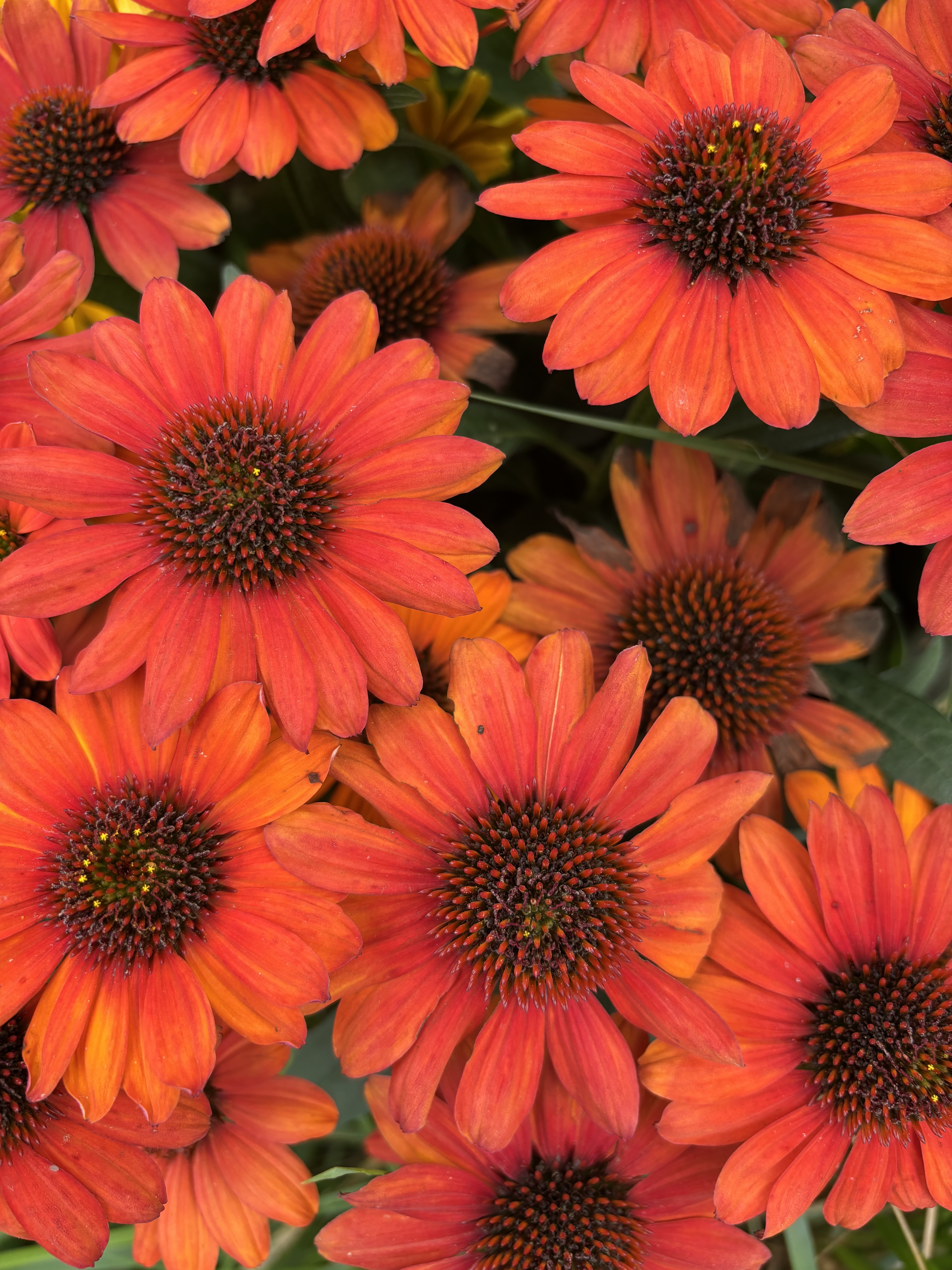
The coneflowers nearly knocked me over. The orange with red against the green was so vibrant I almost had to look away. I like going to the garden center. Flowers are great teachers of color. So are walks in the woods. The garden center is a festival of color saturation while the woods are more of a quiet prayer.
I keep close at hand a National Geographic article about the color of human skin. We do ourselves a disservice to reduce each other to black-and-white. We are a full spectrum of color, glorious in the range of tint-to-shade. We could learn much from Marc Chagall’s observation of the color wheel. Rather than use our skin color to divide-and-conquer, to caste ourselves, to foment blather like eugenics and supremacy, we might open our eyes and see: “All colors are friends of their neighbors and lovers of their opposites.”
Together we are glorious. Separate we are without reference; flat and bland.
Full stop.
read Kerri’s blogpost about CONEFLOWERS
likesharesupportcommentthankyou!

Filed under: Art, Creativity, Flawed Wednesday, Identity, Uncategorized | Tagged: artistry, color, color wheel, coneflowers, contrast, curiosity, david robinson, davidrobinsoncreative.com, experience, Kerri Sherwood, kerri sherwood itunes, kerrianddavid.com, kerrisherwood.com, knowing, knowledge, Marc Chagall, painting, story, studio melange, the melange | Leave a comment »